Team: Jason Cowan, Vince Blasco
Creative Direction
BRanding
web design
design system
packaging
print
illustration
campaigns
Team: Jason Cowan, Vince Blasco
When we set out to redesign the logo we wanted to maintain the spirit of its predecessor. The previous logo wasn’t bad, but it was rigid and only worked well in one format, which limited our design options. As such, we endeavored to create a new version that was much more flexible.


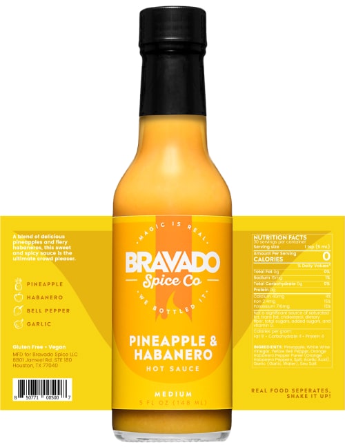
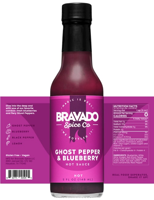
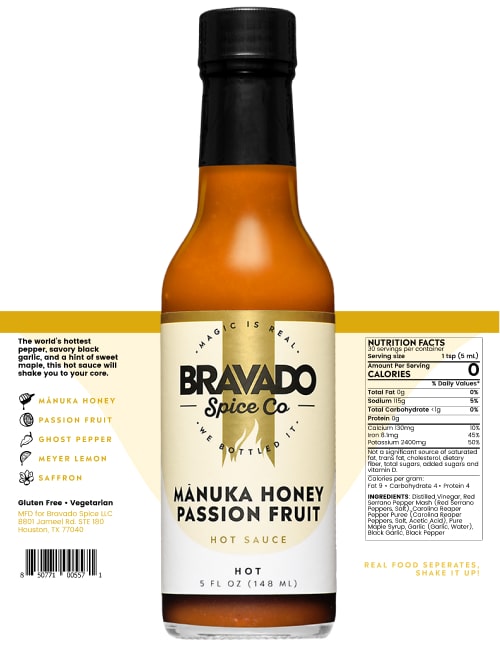
The product lineup at the time consisted of 10 hot sauces, 3 margarita mixes, and 2 seasonings. In our system each of these products needed various levels of color treatment. Ultimately we needed 74 colors.


We also created icons/illustrations to indicate the main ingredients in certain products, suggested pairings, product types, and heat levels.


The next step was to combine the logo, color system, typography system, and iconography into our labels. The hot sauces needed a distinction between the fruity flavors and the “super hots”, so we created a black label variation as a way to indicate heat levels. One notable exception was Mānuka Honey Passion Fruit, which received its own treatment as our premium offering.


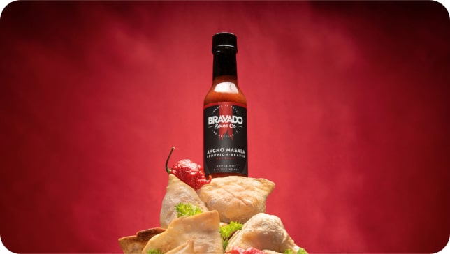
Now that our bottles were ready it was time to produce a lot of photography. We spent a significant amount of time in-house at the studio to create multiple series of engaging photography for use across all of our upcoming campaigns. Major shoutout to Vince Blasco whose work speaks for itself.


The website was essentially the area where all the previous work came together to deliver on the full brand story. Big and bold. Simple and direct.
%201-min.jpg)


